SVG Placeholders: A Lightweight Tool Worth Taking Seriously in Front-End Development
Why SVG Placeholders Deserve Your Serious Attention
When you're building web projects, placeholder images are almost impossible to avoid.
Prototypes need them. Component libraries need them. Automated tests need them too. But have you ever put serious thought into which format to use for your placeholders? Most people just grab a PNG or JPEG without thinking twice. It works, sort of — but it's far from optimal.
SVG placeholders have one advantage that no other format can match: they're vector graphics. What does that mean? Instead of painting with pixels, they draw with mathematical formulas. That distinction makes all the difference in real-world projects.
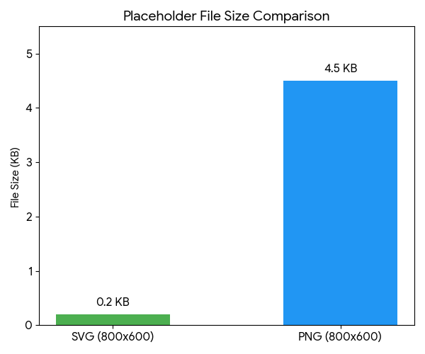
The most obvious benefit is file size. A 600×400 SVG placeholder is typically under 1 KB. A PNG of the same size starts at least at 20 KB, and a JPEG is over 10 KB. The difference isn't even in the same ballpark.
I ran a comparison test during a homepage rebuild project. After replacing 24 PNG placeholders with SVGs, the total image asset size dropped from 1.2 MB to under 15 KB. The mobile LCP — the time it takes to render the largest element on the page — dropped by 0.8 seconds. In a real project, that's significant.
When it comes to clarity, SVGs never get blurry no matter how much you scale them. 1× screens, 3× Retina displays, even 8K monitors — lines and text stay razor-sharp. When you're building high-fidelity prototypes or giving product demos, a blurry placeholder makes the entire page look unpolished. SVGs don't have that problem.
There's another easily overlooked advantage: SVGs are essentially plain text files. You can tweak colors, dimensions, and text right from the browser's address bar. No need to open Photoshop. No need to install any tools.
This "URL-as-image" nature makes team collaboration highly efficient. A designer marks up dimensions and color values in Figma, and a developer simply assembles a URL to get the matching placeholder image. From confirming the requirements to getting the image — under 30 seconds.
Five Scenarios Where SVG Placeholders Shine
We've covered the benefits. Now, where do they fit best?
Scenario 1: Component Library and Design System Development
Building a component library demands a large number of placeholders in different sizes. You need to verify how cards, banners, avatars, and other components behave at various dimensions. SVG placeholders support custom width, height, background color, and label text. You can annotate each image with size info like 400×300. When troubleshooting layout issues, everything is clear at a glance.
Scenario 2: Responsive Layout Testing
When testing responsive breakpoints, you need images in various aspect ratios to verify whether flexbox or grid still works correctly in edge cases. Vector placeholders can be generated on the fly at any size. From a 32×32 small icon to a 1920×1080 full HD banner — just change the URL.
Scenario 3: Technical Documentation and Tutorial Illustrations
When writing a technical blog post or API documentation, using SVG placeholders with custom text as sample images is better than using real photos. Readers won't be distracted by the image content — instead, they'll focus on the image's position and role within the page.
Scenario 4: Open Graph Preview Debugging
When building social sharing features, you need 1200×630 preview images that comply with the Open Graph specification. SVG placeholders can quickly generate test images that meet the size requirements, complete with brand text. No need to wait for the design team to produce assets.
Scenario 5: Automated Testing and Visual Regression Testing
In end-to-end testing, placeholder images are part of your mock data. SVG placeholder content is determined entirely by URL parameters, so you can precisely control the appearance of every image. This ensures the reproducibility of your test cases. CI/CD pipelines can also dynamically generate the required image assets on the fly.
Generating SVG Placeholders with MockImg: A Complete Tutorial
Enough theory. How easy is it in practice? Open your browser and type this into the address bar:
https://mockimg.dev/600x400.svg
Hit Enter, and a 600×400 SVG placeholder appears. No sign-up, no installation — just one URL and you're done.
Want a different size? Just change the numbers. 200x200.svg gives you a square, 1920x1080.svg a full HD banner, and 1200x630.svg the standard OG preview size. Width and height support ranges from 1 to 4096 pixels.
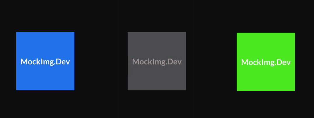
Custom Background and Text Colors
Not a fan of the default gray? Specify your own colors:
https://mockimg.dev/600x400/3B82F6/FFFFFF.svg
The URL structure is /{width}x{height}/{background-color}/{text-color}.svg. Colors use HEX format — the standard way of representing colors with six hexadecimal digits, without the # symbol. 3B82F6 is a medium-brightness blue, and FFFFFF is white. Copy the color values straight from your design files, and your placeholder will match your page's color scheme perfectly.
Adding Custom Text
The default display shows dimension info. Want something more meaningful? Add a text parameter:
https://mockimg.dev/800x400/1E293B/F9FAFB.svg?text=Hero+Banner
The image will display "Hero Banner." The plus sign represents a space. This feature is especially handy when prototyping pages — place a labeled placeholder in each position so that every team member can see at a glance what will go there in the future.
Font Selection and Bold Text
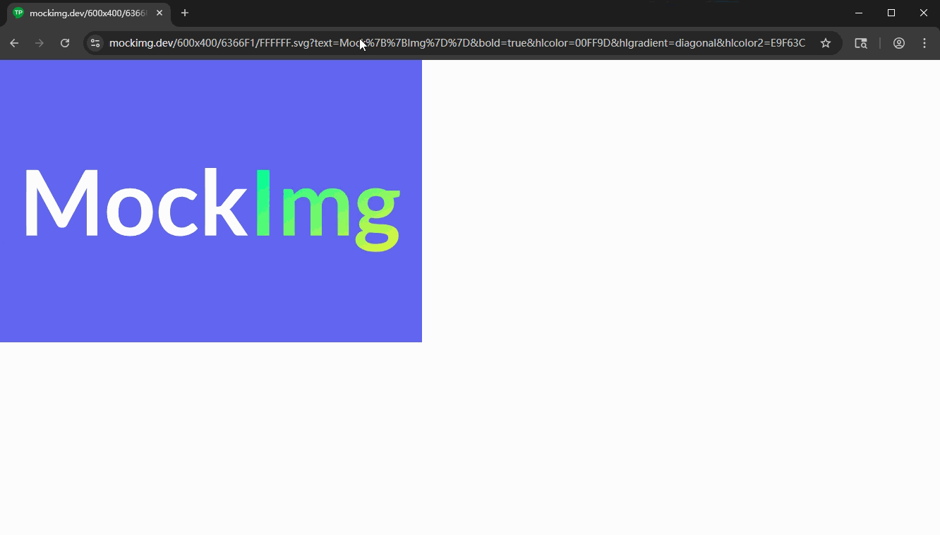
The default font not striking enough? Switch fonts and add bold styling:
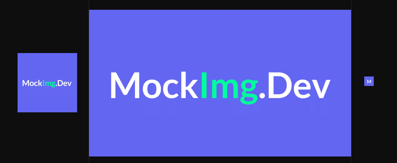
https://mockimg.dev/600x400/6366F1/FFFFFF.svg?text=MockImg&font=Poppins&bold=true
MockImg comes with over 60 multilingual fonts built in. Latin fonts like Poppins and Inter? Got them. Chinese fonts like LXGW WenKai and HarmonyOS Sans? Got those too. Japanese, Korean, Arabic — 23 languages are fully covered. Bold styling is just a bold=true away.
 |
 |
 |
Gradient Backgrounds
Tired of solid colors? Try gradients:
https://mockimg.dev/600x400/6366F1/FFFFFF.svg?gradient=diagonal&bgcolor2=EC4899The gradient parameter controls the direction and supports three options: horizontal, vertical, and diagonal. bgcolor2 specifies the end color of the gradient. Gradient placeholders look much better when prototyping landing pages — they won't feel too rough.
 |
 |
 |
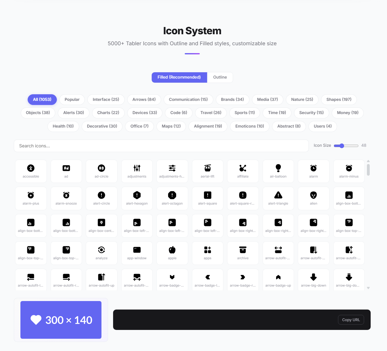
Overlaying Icons
MockImg has a particularly powerful feature — overlaying icons onto placeholders:
https://mockimg.dev/400x300/10B981/FFFFFF.svg?icon=filled/heart&text=Love
Icons come from the Tabler Icons library, with over 5,000 to choose from. Both Outline and Filled styles are supported. You can also control the icon's color and size independently:
https://mockimg.dev/400x300/3B82F6/FFFFFF.svg?icon=filled/star&iconcolor=FFD700&iconsize=64
When you pass only an icon without text, the icon automatically scales up and centers itself. Perfect for avatar placeholders or favicons:
https://mockimg.dev/200x200/8B5CF6/FFFFFF.svg?icon=filled/user
 |
 |
 |
 |
Transparent Backgrounds
Need a placeholder with a transparent background? Just add bg=transparent:
https://mockimg.dev/400x300.svg?bg=transparent&text=Transparent
The SVG format natively supports transparency — no extra file size overhead for alpha channels like with PNG. This is really useful when overlaying on other elements for watermarks or avatars.

Final Thoughts
Looking back at the full set of technical characteristics of SVG placeholders, the core value comes down to one thing: getting the most reliable visual placeholder with the least overhead.
The vector format guarantees small file size and zero quality loss. URL parameterization frees you from image editing tools. In component library development, responsive testing, documentation illustrations, OG preview debugging, and automated testing — these five scenarios — SVG placeholders can tangibly boost your workflow efficiency.
All the features demonstrated above can be operated visually in MockImg's online placeholder generator. Open the site, tweak the parameters, preview in real time, copy the URL — the entire process takes under 10 seconds.
Never tried using SVG for placeholder images? Now's the time to start. One URL. That's all you need.